Continuous improvement of the V4 back office
Written by Jerome Granados on
Since the release of GoodBarber 4.0 we’ve been intent on improving the user experience for the new back office.
Every day we analyze user behavior in the new GoodBarber interface. Studying these patterns has allowed our Product team (designers, ergonomists…) to measure whether our approach is the right one. In other words, do the users navigate the product in the way we had envisioned?
Every Product Manager’s dream is to catch a glimpse of how users experience the product, to watch and understand how they react in front of the interface upon discovering it. Thanks to data analysis and Data Driven Design, this dream is becoming a reality.
Many tools allow us to collect precious information as the interface is being used. Analyzing this data allows us to have a clear picture of the user’s actual path at a given point in time. From that analysis, designers and ergonomists can perform changes to the product interface in order to improve the user’s journey.
Modifications are applied through subsequent iterations. For each iteration, the Product team and the team in charge of data analysis (Data Scientists) measure the impact of the modification, in real time. For a product like GoodBarber, we can tell after just 24 hours whether the modification applied to the back office has had a positive or negative impact on the user experience.
An example
Let’s take, for example, the way the main navigation of the app is built with GoodBarber 4.0.
One of the biggest advances introduced by GoodBarber 4.0 is the possibility to build one’s navigation independently from the content sections.
When we first launched GB4, navigation mode management (the Menu) and content management (the Sections) were completely uncorrelated. After a careful analysis of users’ journeys inside the back office, we’ve come to realize that this approach wasn’t intuitive enough. It didn’t allow for an easy conceptualisation of the app navigation. We therefore introduced some improvements.
Without compromising the independence we introduced between the sections and the menu, we’ve managed to organize the way the navigation is built inside the app differently.
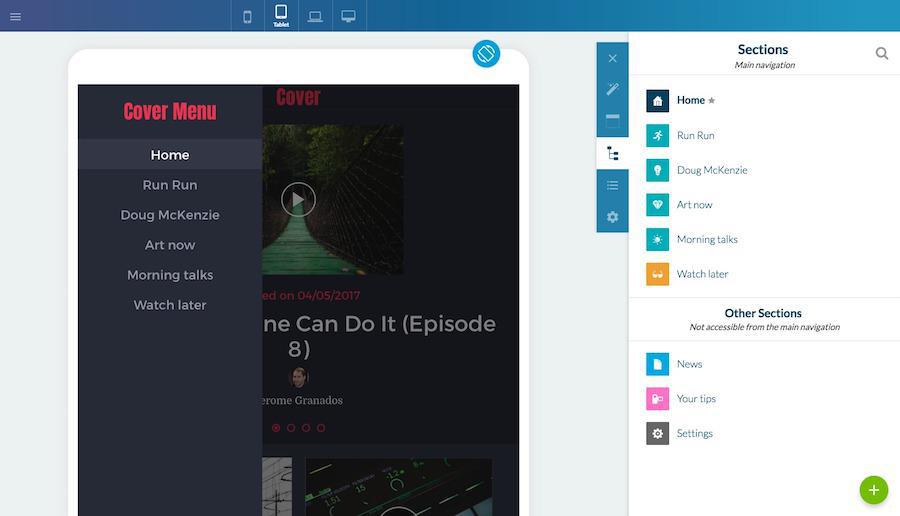
Sections and other sections
The menu Builder > Content is now divided into 2 parts.
The top area of the panel - Sections - is where you’ll find the sections featured in the main navigation.
The bottom area of the panel - Other Sections - is where you’ll find the sections not available from the navigation mode.
It is possible to simply drag and drop a section from one part to the other and vice versa.
Menu design
The menu Builder > Navigation mode > Menu displays the links towards the sections available from the app navigation. This menu is now dedicated only to managing the Menu’s design. From there, you can modify the icons, fonts, link colors… and, depending on the template which you’ve selected, add titles, separators and shortcuts in the header and footer of the menu.
Interface modification consequences
This modification of the way the sections are organized allows the user to more easily understand how to build the navigation of their app. In terms of data analysis, this translates into more time spent in the back office, and more precisely a more advanced exploration of the navigation modes available and an in increase in the customization of the app.
Continuous improvement
The back office improvement phase which started after the release of GoodBarber 4.0 is a mandatory step to ensure ease of use for all GB4 users. As we make more discoveries, we bring about the necessary adjustments and corrections, so that the answer to the question—How to create my app with GoodBarber 4.0?—will be as simple as possible.
Last but not least, I know existing users are eager to migrate their V3 apps into V4 apps. We must ask that you remain patient a little while longer—thanks to the feedback we are getting on a regular basis, we are working on setting up a fantastic back office for you.
Last but not least, I know existing users are eager to migrate their V3 apps into V4 apps. We must ask that you remain patient a little while longer—thanks to the feedback we are getting on a regular basis, we are working on setting up a fantastic back office for you.