 eCommerce
 Memberships
 Online Courses
 Bookings
 Travel guide
 Events
 Employee Communication
 Content Creators
 Pickup & Delivery
 Newspaper
 Radio
Radio Schools
 Faith
Faith Organizations
 Restaurant
 Grocery
 Custom apps
 PRODUCT RESOURCES
 TOPICS
 TECHNOLOGY
 MOBILE APPS RESELLERS
 DISCOVER
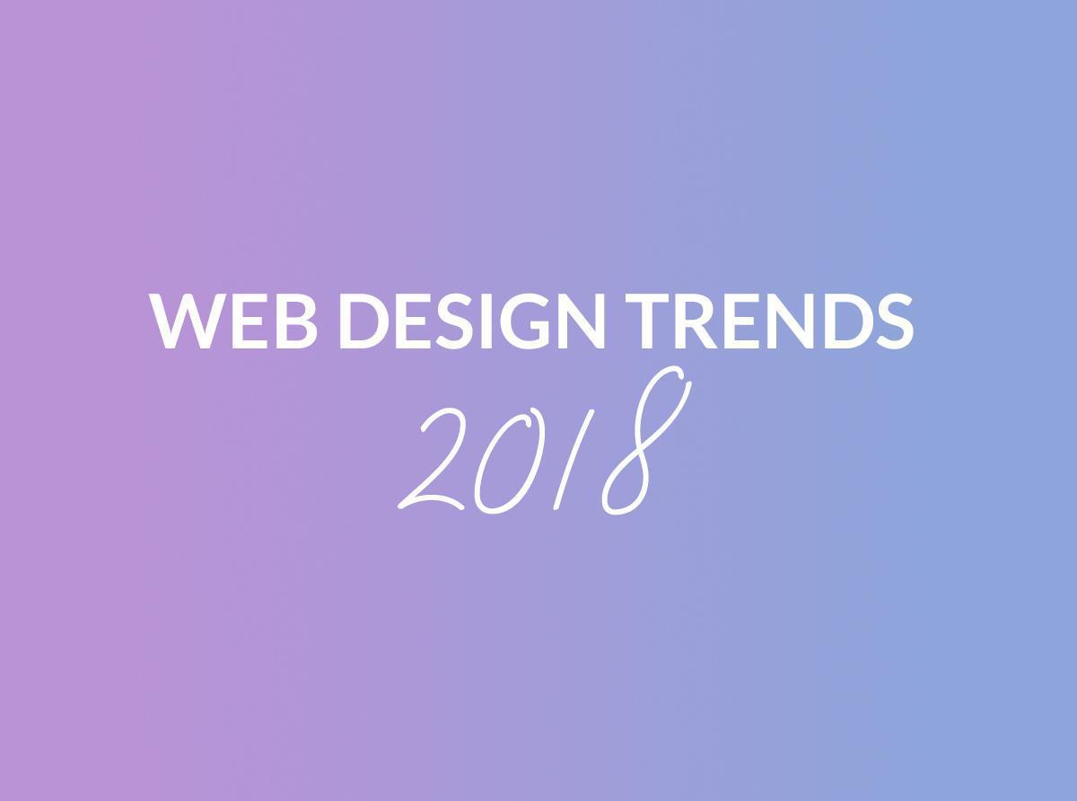
Top 5 Web Design Trends of 2018
Written by Muriel Santoni on
While being present on the web is vital for your business, it's no longer enough. To set yourself apart and achieve user retention, it is essential to give them the best experience possible, both in terms of use and design. Everyone can agree that in 2018, the user will be at the top of the list of priorities for web designers, which means that new habits will have to be adopted, specifically in terms of experience, navigation, and interaction.
Without further ado, here are the top 5 trends to follow to best represent yourself on the web–on mobile just as much as desktop.
1) Bright colors and gradients
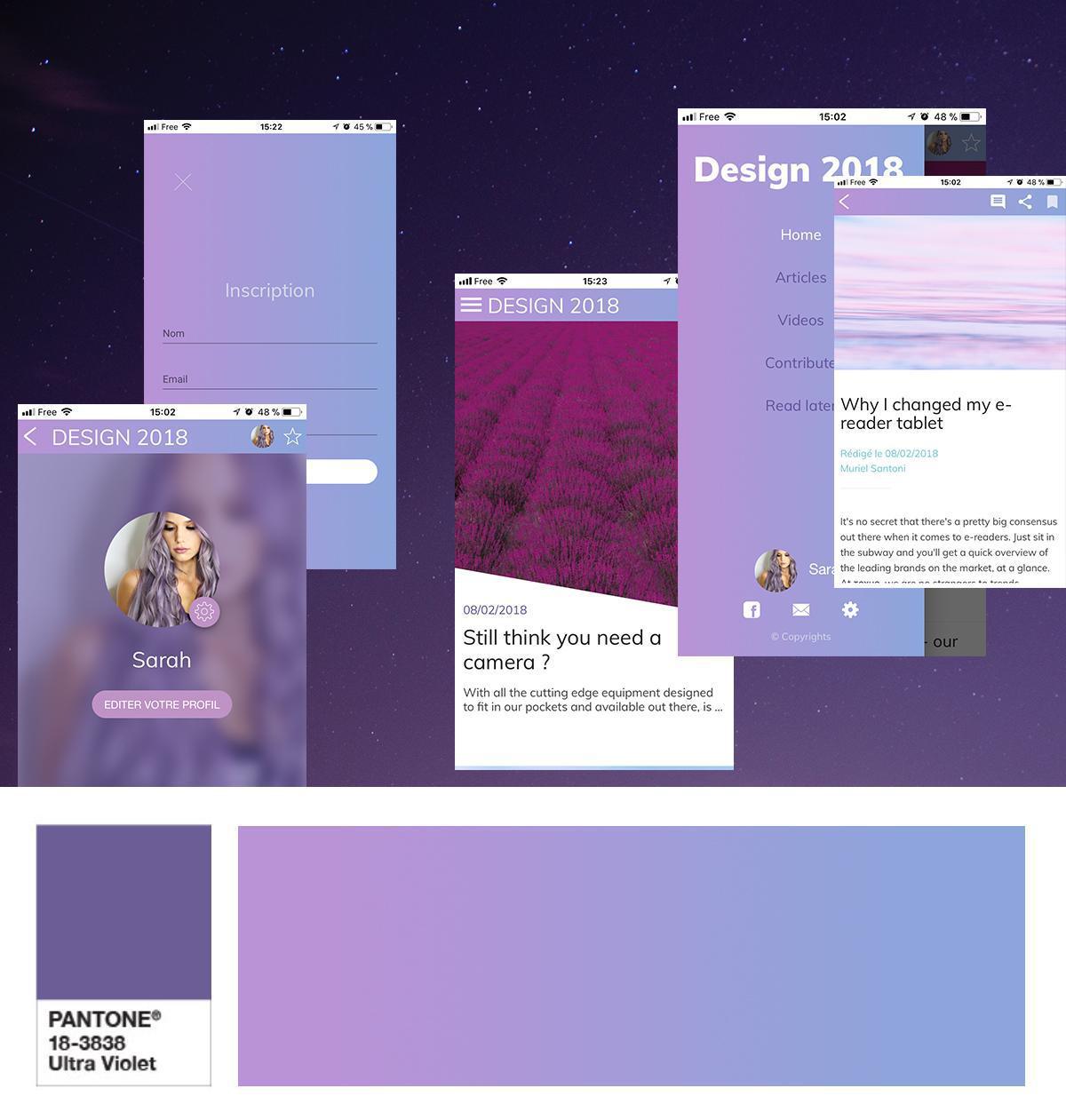
If you're not totally ready to integrate these types of colors, you may be a fan of the second big color trend : gradients. Applied in the background, as a filter on your visuals, or even in your navigation modes, gradients bring just the right dose of color to any design.
2) New navigation modes
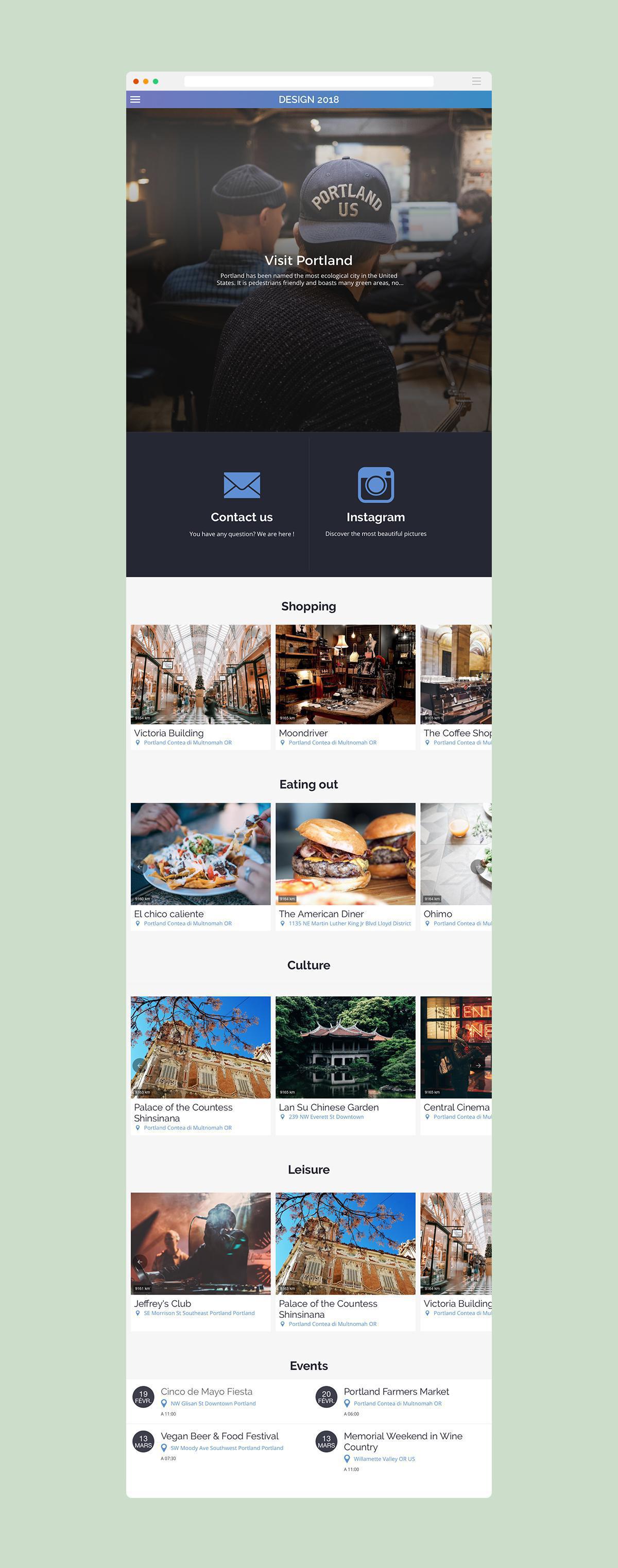
This is why, as we have the habit of browsing a desktop website via the categories presented in a classic menu, it is now more intuitive to go towards layouts that use a scrolling system as a navigation tool. The user therefore finds the most useful information and categories on just one, single page he can browse with a simple sliding motion. This trend can be associated with a secondary, more classic navigation mode, but offers the huge advantage of retaining users who will have no chance of getting lost in your site/app.
3) Empty spaces
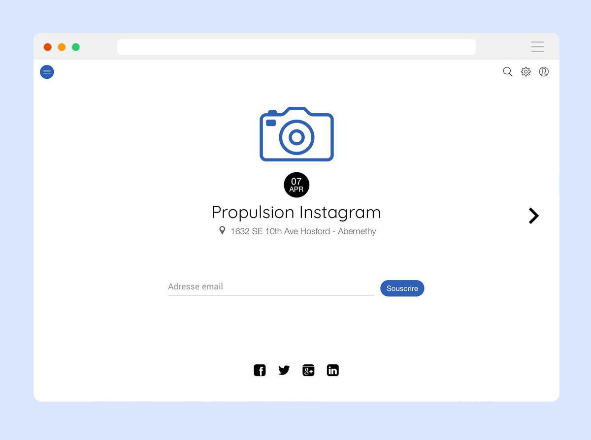
Here's a trend that, despite what you may think, can be very easily combined with the first one we presented. Blank spaces are becoming more and more present across the web and it's not for nothing.
Aerating your design allows you to bring value to the elements of your choice : events you want to promote, special offers, call to actions... Keep in mind that the busier your page is, the lower the chances are for your users to linger on important elements. Don't be afraid to say no to filling up all available space. Blank spaces only reinforce the spotlight on your important elements, allowing you to accentuate them through the colors of your choice.
4/ Carefully crafted font characters
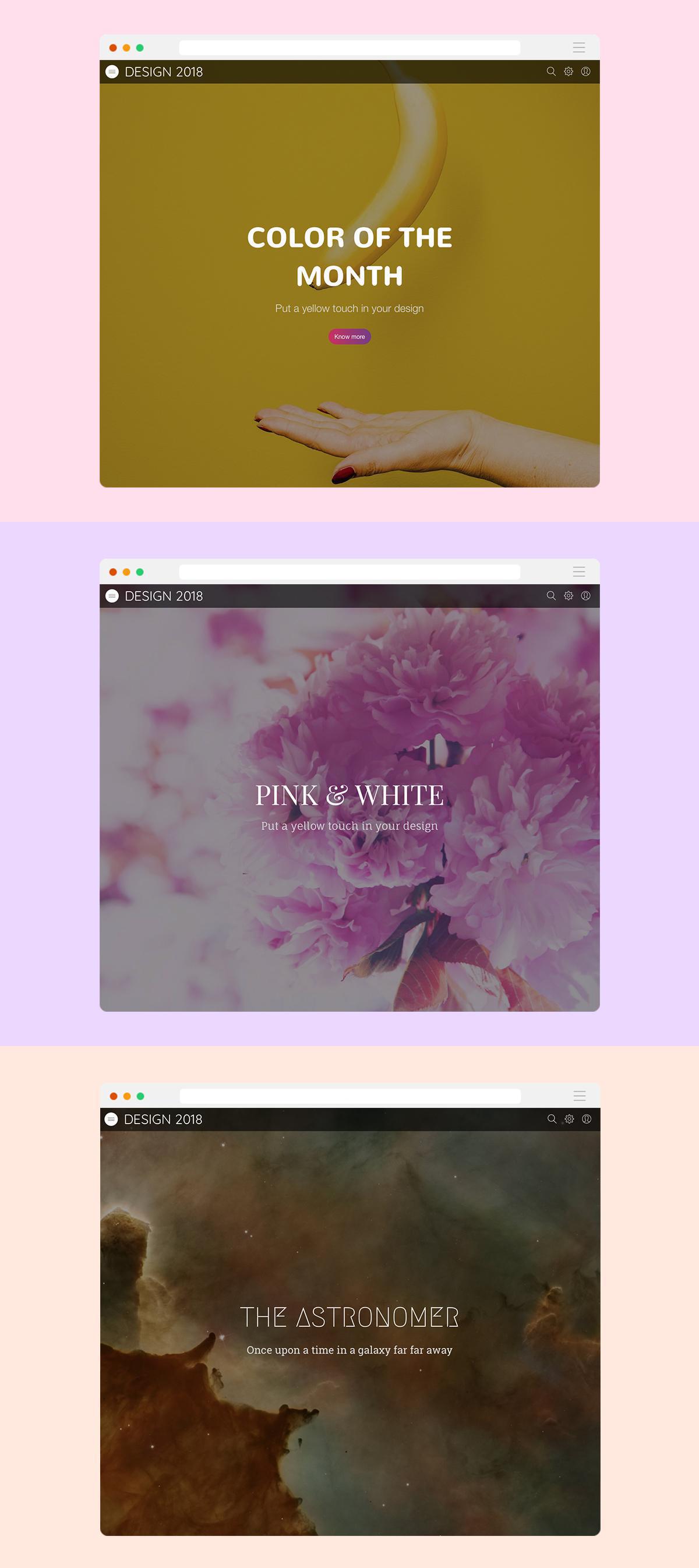
2018 is definitely the year of typography. Having been limited for quite a while due to clarity concerns, it's finally making its come back and bringing life and character to web pages. Typography is now a design element, just as images are, that can guide your users.
Keep in mind still that your page must not be oversaturated; forget about a detail-heavy image as the background of several lines of text in hand-written font. Find the right balance and let your imagination run free to show off your content.
5/ Mobile before everything
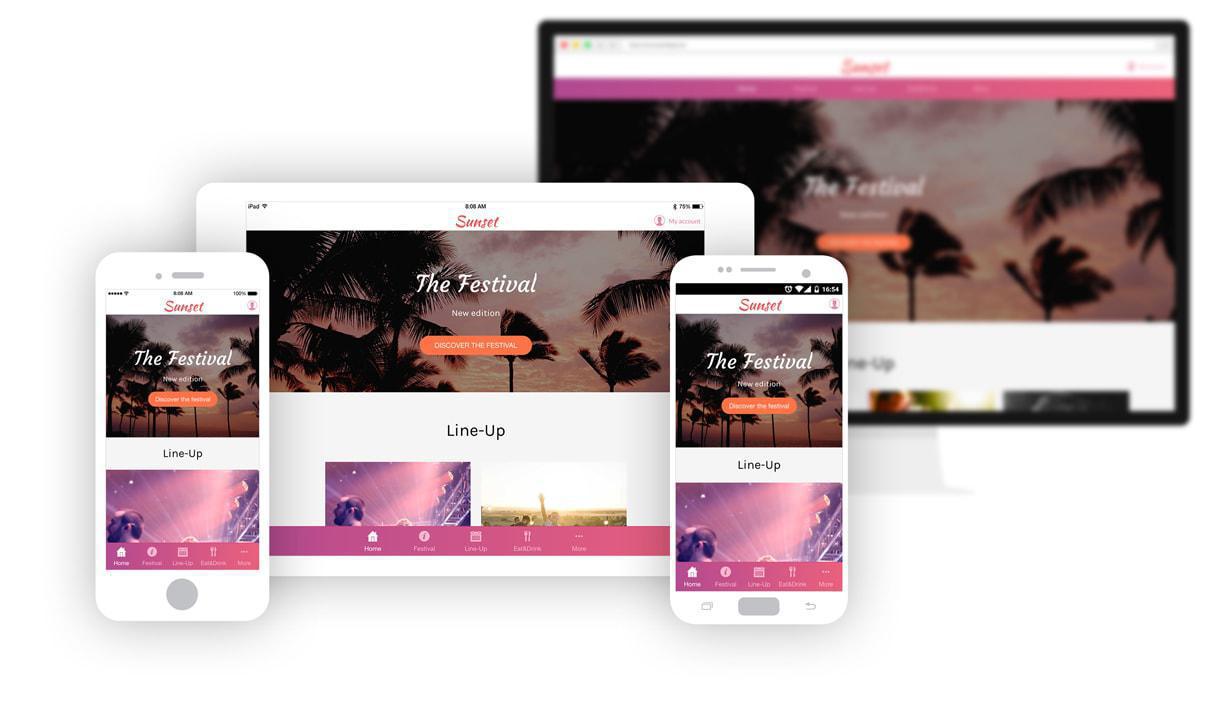
Opting for a Progressive Web App is the most optimal solution possible, since it ensures an optimal rendering on all devices and adapts the content and features based on the capabilities of the device it's being used on.
Although you don't have to follow these trends explained here to a T, keep in mind that this criteria will definitely play a role in the retention and conversion of your users. In addition, the most undeniable trend of this year that is only going to magnify over time, is Mobile First. Regardless of the trends you choose to follow or not to follow, you can't escape this one.